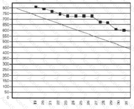
The burndown chart displayed shows two lines:
A diagonal guideline (ideal trend line) representing the expected or planned burndown rate.
A line with plotted black squares representing the actual progress of work completed during the iteration (typically in story points or hours).
The actual progress line (with black squares) stays consistently above the ideal line throughout the iteration.
This indicates that less work was completed than planned at each point in time.
Toward the end of the iteration (around the 30th or 31st), the chart shows that the total remaining work does not reach zero—implying incomplete work by the iteration’s end.
Analysis of the Chart:Interpretation According to Agile Standards:According to the PMI Agile Practice Guide (Section 5.4: Tracking Iteration Progress) and Mike Griffiths ' PMI-ACP Exam Prep Book (Chapter 6: Adaptive Planning):
A burndown chart that remains above the ideal line and does not reach the baseline (zero) by the end of the iteration reflects that the team is behind schedule and did not complete all planned work.
The burndown chart is a primary information radiator for evaluating scope completion versus time and is a critical tool for monitoring iteration performance.
Therefore:
" It trended behind schedule and did not complete everything on time. "
Option A is incorrect — the chart clearly shows a lag behind schedule.
Option B is incorrect — there is no indication that the iteration time box was extended.
Option D is incorrect — the team did not finish early or complete all tasks.